Design plays a crucial role in capturing your audience’s attention and leaving a lasting impression. This is why designing effective marketing materials should never be taken for granted. When it comes to design, typesetting and layout are two critical elements that can make or break the success of your marketing efforts.
Typesetting refers to the process of arranging text on a page or document in a way that is visually appealing and easy to read. It involves choosing the right fonts, spacing, alignment, and other design elements to create a cohesive look that supports the overall message being conveyed.
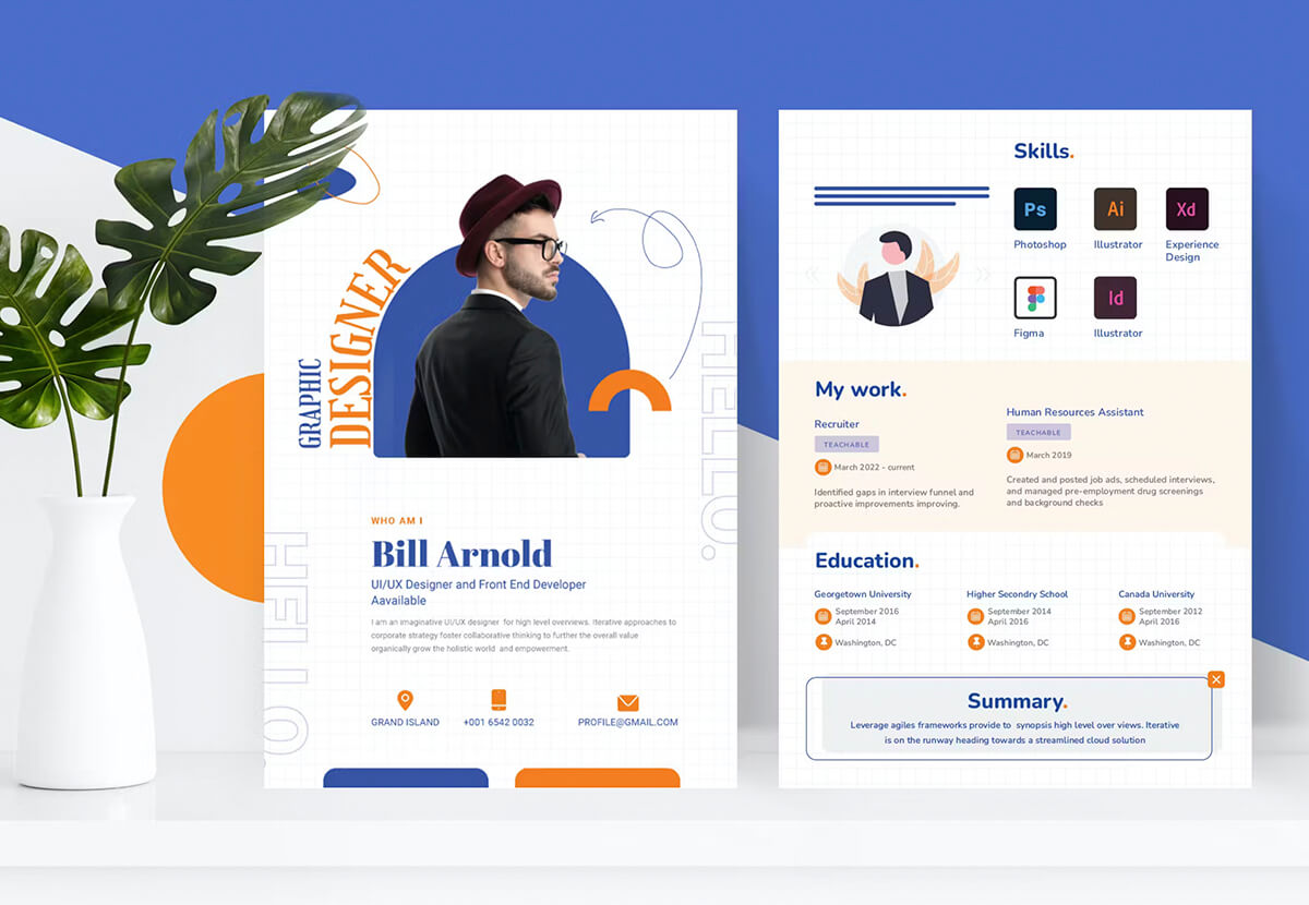
Effective typesetting is crucial in marketing materials because it can make or break the success of a campaign. Poorly designed marketing materials with hard-to-read text can be off-putting for potential customers and may cause them to lose interest in your brand altogether.
On the other hand, well-designed marketing materials with thoughtful typesetting help grab attention, convey information clearly and concisely while also enhancing your brand’s image. Proper use of typography helps establish credibility by making content appear more professional and organised.
Choosing appropriate font styles that match the personality of your brand is key when applying typesetting principles. For example, if you run an eco-friendly business, using natural-looking typefaces might make sense rather than more formal-looking ones.
Elements within Typesetting
When it comes to typesetting, there are several key elements that designers need to keep in mind.
- One of the most important is font choice. The right font can make or break a design, so it’s crucial to choose one that matches the brand’s personality and style.
- Another element of effective typesetting is spacing. Proper spacing between letters and lines helps improve readability and makes the text easier on the eyes. It also plays a role in creating hierarchy within the design.
- Alignment is another essential aspect of typesetting. Aligning text correctly creates a cohesive look throughout the design while adding balance and structure to the layout.
- When selecting fonts for your marketing materials, consider choosing contrasting styles that complement each other well. This will help create visual interest without being overwhelming or distracting for viewers.
- Spacing should be used intentionally to guide readers through your content while keeping their attention focused on what matters most. Adequate spacing ensures easy reading while helping you achieve an overall clean, polished look.
Tips for Effective Typesetting
One of the most important factors to consider when it comes to effective typesetting is choosing a font that matches the brand’s personality. A font can convey different emotions and characteristics, so it’s crucial to choose one that aligns with your brand values and goals.
For example, if you’re designing marketing materials for a luxury brand, you might want to use a serif font that exudes elegance and sophistication. On the other hand, if you’re creating materials for a modern tech company, sans-serif fonts with clean lines could be more fitting.
Another key aspect of effective typesetting is using appropriate spacing for readability. Poor spacing can make text difficult to read or even illegible. The right amount of space between letters (kerning), words (tracking), and lines (leading) can significantly improve legibility and overall design aesthetics.
It’s essential to strike balance between tight letter-spacing which makes reading difficult versus loose letter-spacing which looks unprofessional. As a general rule of thumb: increase spacing slightly when using small fonts; decrease it slightly when using larger ones.
The Importance of Layout
Layout refers to the arrangement of visual elements on a page, including images, text, and white space. It’s important in marketing materials because it can influence how viewers perceive the brand or message being conveyed. A well-designed layout can create interest and guide the viewer’s eye through the content.
Composition is an important aspect of layout design as it determines how all elements are arranged on a page. The composition should be balanced and have a clear hierarchy with focal points that draw attention to key information.
Hierarchy refers to the order in which information is presented visually. This helps guide viewers through the content in order of importance. The use of font size, colour contrast and weight are common techniques for establishing hierarchy.
Balance is another critical element of layout design as it helps maintain harmony between different visual elements. Balance can be achieved by using symmetry or asymmetry depending on what works best for your specific design needs.
Using a grid system is an effective way to ensure consistency throughout your designs while also maintaining balance across pages or platforms where multiple pieces will appear next to each other.
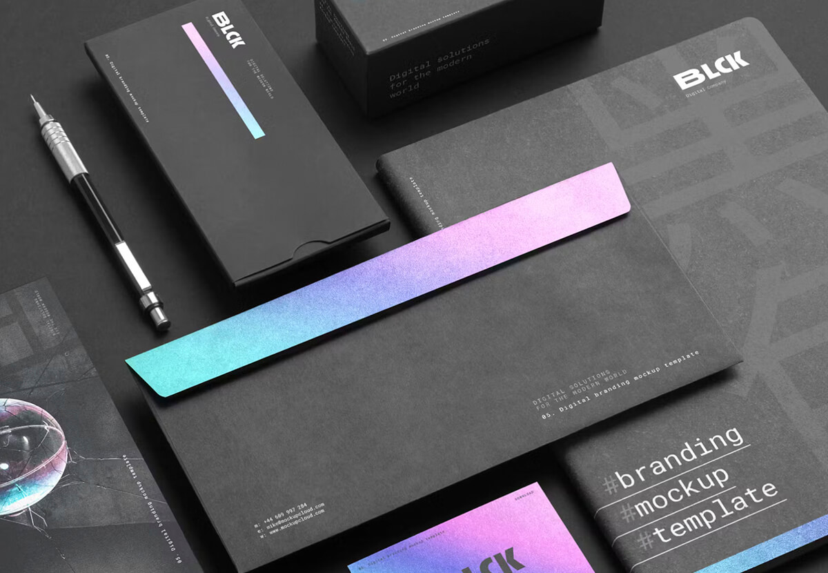
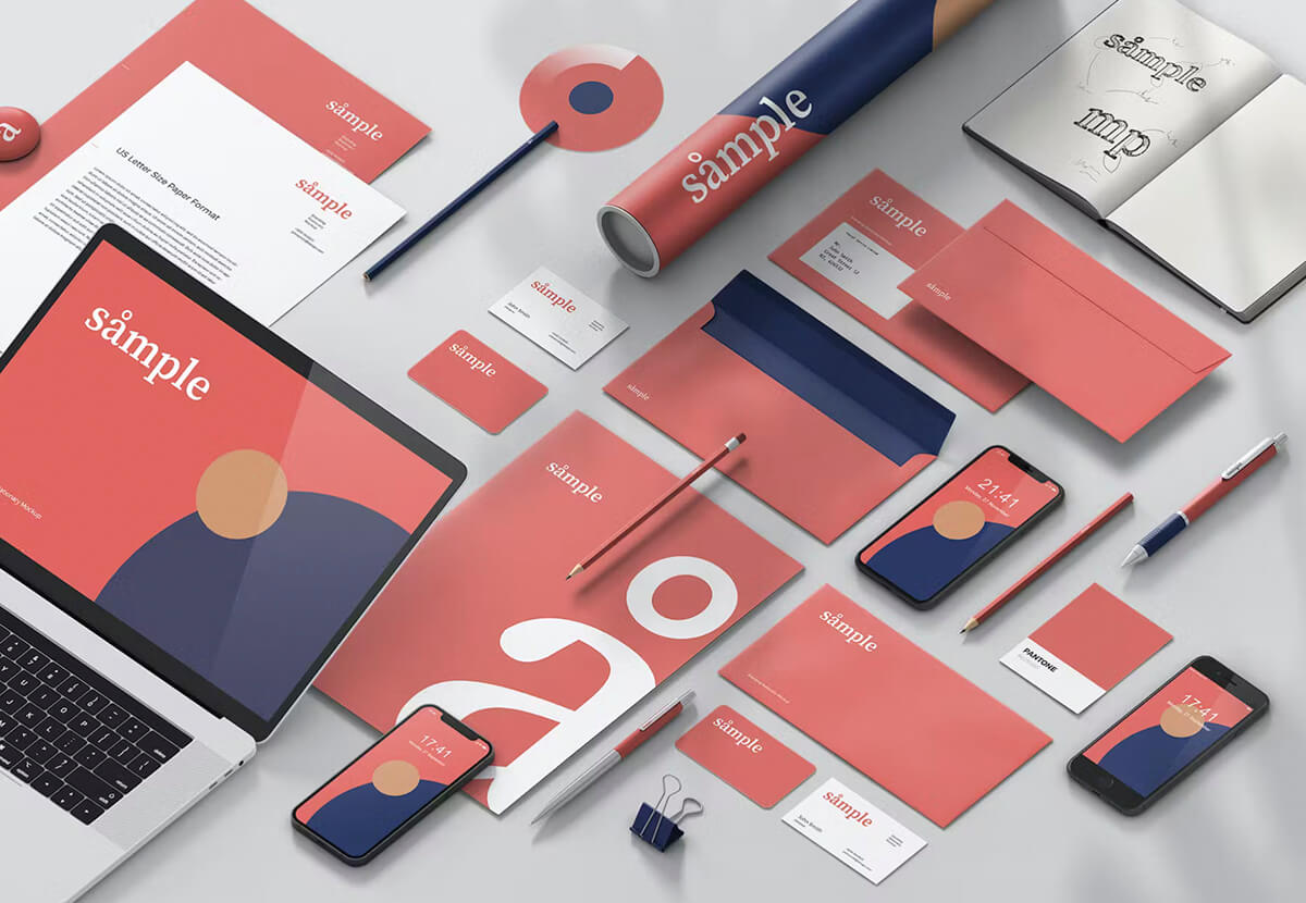
Composition, Hierarchy & Balance
Designing effective marketing materials requires a good understanding of layout and its different elements. Composition is one such element, which deals with the arrangement of various design elements on a page. Proper composition can help create balance, contrast, and visual interest in your design.
hierarchy determines the order in which information should be presented to the viewer. For example, headlines and call-to-action messages are usually placed at the top of a design to grab attention while secondary information is placed lower down.
Balance refers to how visually heavy or light an element appears on a page. Achieving balance through strategic placement of elements can make a design more aesthetically pleasing and easier for viewers to navigate.
Alignment is another vital component that helps create structure within a design by ensuring all elements are lined up properly. It provides unity and consistency throughout the piece.
When it comes to creating effective marketing materials, the layout is just as important as the typesetting. A good layout can make all the difference in whether or not your message gets across to your target audience.
Don’t overcrowd your design with too many elements or information; leave some white space around each element so they have room to breathe! White space can help guide the viewer’s eye through the content more easily while providing emphasis on key points
How Typesetting and Layout Work Together
Typesetting and layout are two key elements of graphic design that work together to create effective marketing materials.
When these two elements are combined effectively, they can help convey a message clearly and visually appealingly. The right font choice with appropriate spacing can make text easy to read for the audience. A well-organised composition with proper hierarchy can guide their eyes through important information in an intuitive way.
The relationship between typesetting and layout is like harmony in music – when everything works together seamlessly, it creates a pleasing experience for those who consume it. Choosing complementary fonts that match brand personality is one part of creating harmony while using grid systems helps achieve consistency across all layouts.
It’s also essential to strike a balance between typesetting and layout – too much clutter or poor organisation can lead to confusion and disinterest from potential customers. Using hierarchy properly by making certain pieces stand out above others will keep audiences engaged without overwhelming them with too many options at once.
Adapting typesetting and layout techniques across various marketing materials such as brochures or social media graphics remains crucial for maintaining brand identity throughout different mediums as each comes with its own set of unique challenges that require great attention to detail.
Tips on Balancing Typeset and Layout
Balancing typesetting and layout is crucial in creating effective marketing materials. One way to achieve this balance is by using hierarchy to guide the viewer’s eye. Hierarchy refers to the arrangement of elements in a design according to their level of importance.
To create an effective hierarchy, start with the most important element and make it stand out through size, colour or placement. Then, use a smaller font size or lighter colour for secondary information. This will help viewers easily understand what they are supposed to focus on first.
Another tip for balancing typesetting and layout is avoiding cluttered designs. A cluttered design can be overwhelming and confusing for your audience, making them less likely to engage with your content.
To avoid clutter, keep whitespace between elements and limit the number of fonts used in a design. Stick to one or two fonts that complement each other well instead of using multiple contrasting ones.
Remember that less is often more when it comes to designing marketing materials. By following these tips for balancing typesetting and layout, you can create compelling designs that effectively communicate your message while keeping viewers engaged with clean visuals.
Creating Effective Marketing Materials
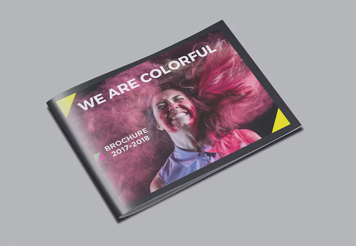
Typesetting and layout are crucial elements of creating effective marketing materials that can be applied to different types of media. For example, brochures require a clear hierarchy in the typography so that readers can quickly find important information. Bold headings and subheadings, paired with easy-to-read body copy, create an organized and professional layout.
Flyers, on the other hand, need to grab attention quickly while conveying necessary information about products or services. A strong focal point created through bold typography helps draw viewers in while appropriate spacing ensures easy readability.
When it comes to social media graphics for platforms such as Instagram or Facebook, there are additional considerations to keep in mind. Font size must be easily legible on smaller screens, while using colour psychology effectively can help elicit specific emotions from viewers.
Understanding how typesetting and layout apply differently across various marketing materials is essential for crafting successful designs that capture audiences’ attention and convey key messages effectively.
Tips for Creating a Unique Brand
When it comes to creating a unique brand style through typesetting and layout, there are a few key things to keep in mind. First and foremost, it’s important to understand your brand’s personality and values. Is it bold and modern or classic and traditional? Once you have this established, you can begin selecting fonts that align with the overall vibe of your brand.
Another tip is to consider incorporating custom typography into your designs. This can be anything from creating a unique letterform for one specific word in your logo or using hand-drawn elements throughout your marketing materials.
In addition to font choice, layout plays a crucial role in establishing a cohesive brand style. One way to do this is by using consistent grid systems across all design pieces. This will help maintain consistency while allowing for flexibility within each individual design.
In today’s competitive business environment, effective marketing materials are crucial for success. Typesetting and layout play a significant role in creating compelling designs that capture the attention of potential customers.
If you’re looking for professional typesetting and layout services, contact us today to learn more about how we can help take your business’s marketing material and branded stationery to new heights!
Contact us today and find out how to wow your customers: email design@printready.ie or call us on (01) 858 1000 to discuss your ideas.