
Creating a brand is all about colour. A strong brand identity is based on understanding the importance and impact of colour, especially when considering how to develop your own brand. When colour is taken as a whole, it has no meaning but it conveys feelings and emotions that change according to culture, time, experience, gender, etc.
A fundamental understanding of colour perception in graphic design is crucial to create a palette that evokes the right reaction from the audience.
To do this, you must understand colour perception in brand design. Colours on the warm end of the spectrum such as red, yellow, and orange are said to be forward-looking, energetic and bold, but those on the cooler side of the spectrum, such as blues and greens, are said to be still and subtle.

The Right Approach
It is essential to select a colour palette that fits your strategic positioning if you want to convey a simple message. Engaging your customers successfully requires that you consider the tone and colour combination. Colour is the defining element of identification and association with both brands, whether it is a green coffee shop logo or big yellow arches, highlighting the impact this decision can have.
Who is the Target Audience?
What are the people you are appealing to and what is it that they care about? What methods do you use to engage your audience? In order for your brand to be distinctive in the market and to stand out from the competition, you need to select a colour or colours that anchor your core values.
It is vital to ensure your audience trusts your brand and that the reliability of your product is communicated. The overall perception can be damaged if the colour and tone of the brand change too frequently or are inconsistent.
With a consistent brand image, you can build greater familiarity with your customers and have a stronger relationship with them. So, choosing your brand’s colours carefully is essential. Colours can define a brands core values, enabling greater awareness . Colours help to give a brand its own unique personality, which helps to make your brand stand out from the crowd.
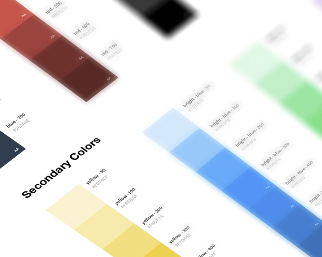
Colour and Their Meanings
- Red – Excitement, danger, and anger
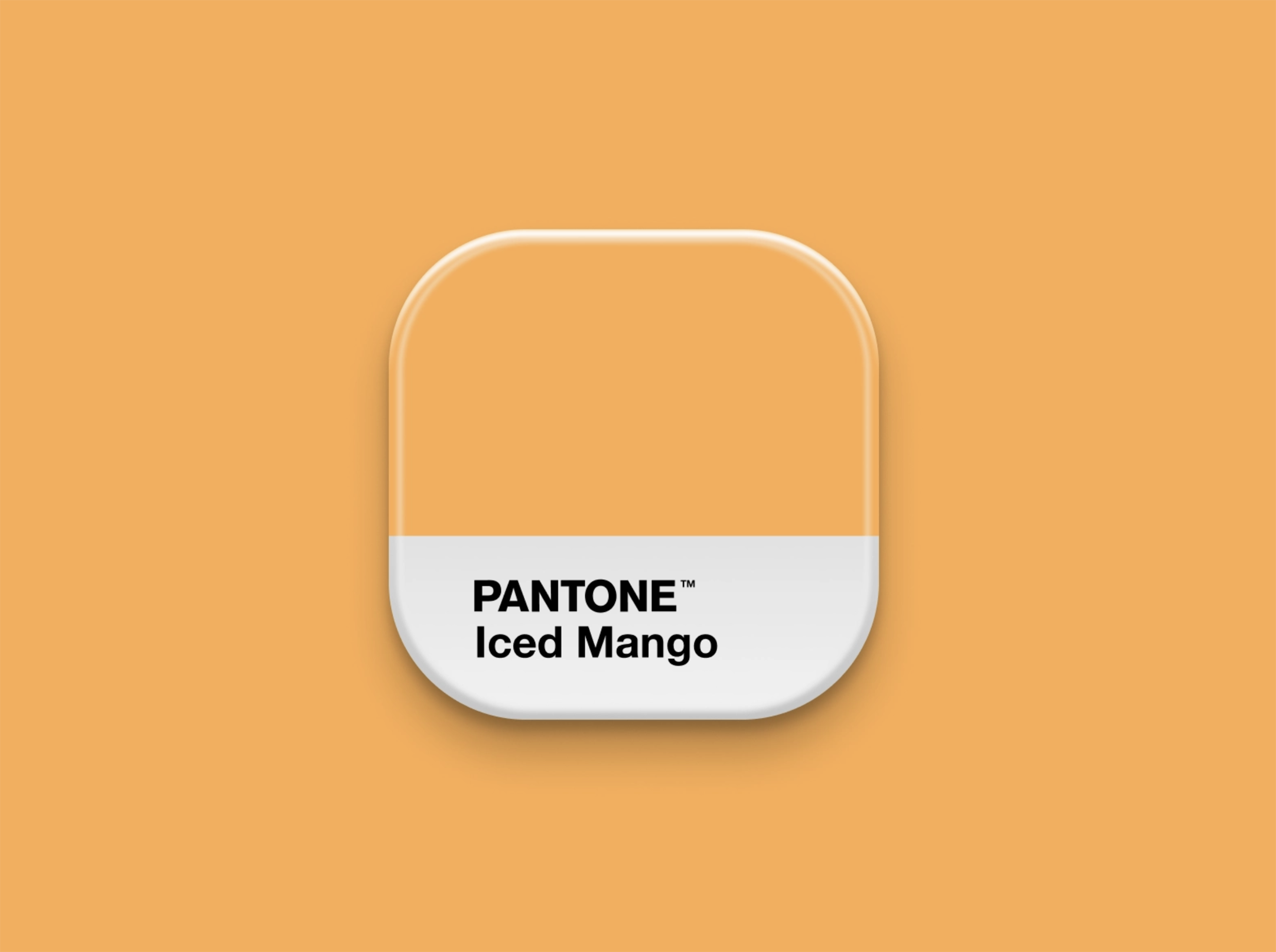
- Orange -Happiness, Playfulness, vitality and friendliness
- Green -prosperity, calming, relaxing, stability, health, wealth, and growth
- Light Blue -Tranquillity, trust, openness, calmness, spirituality, and innocence
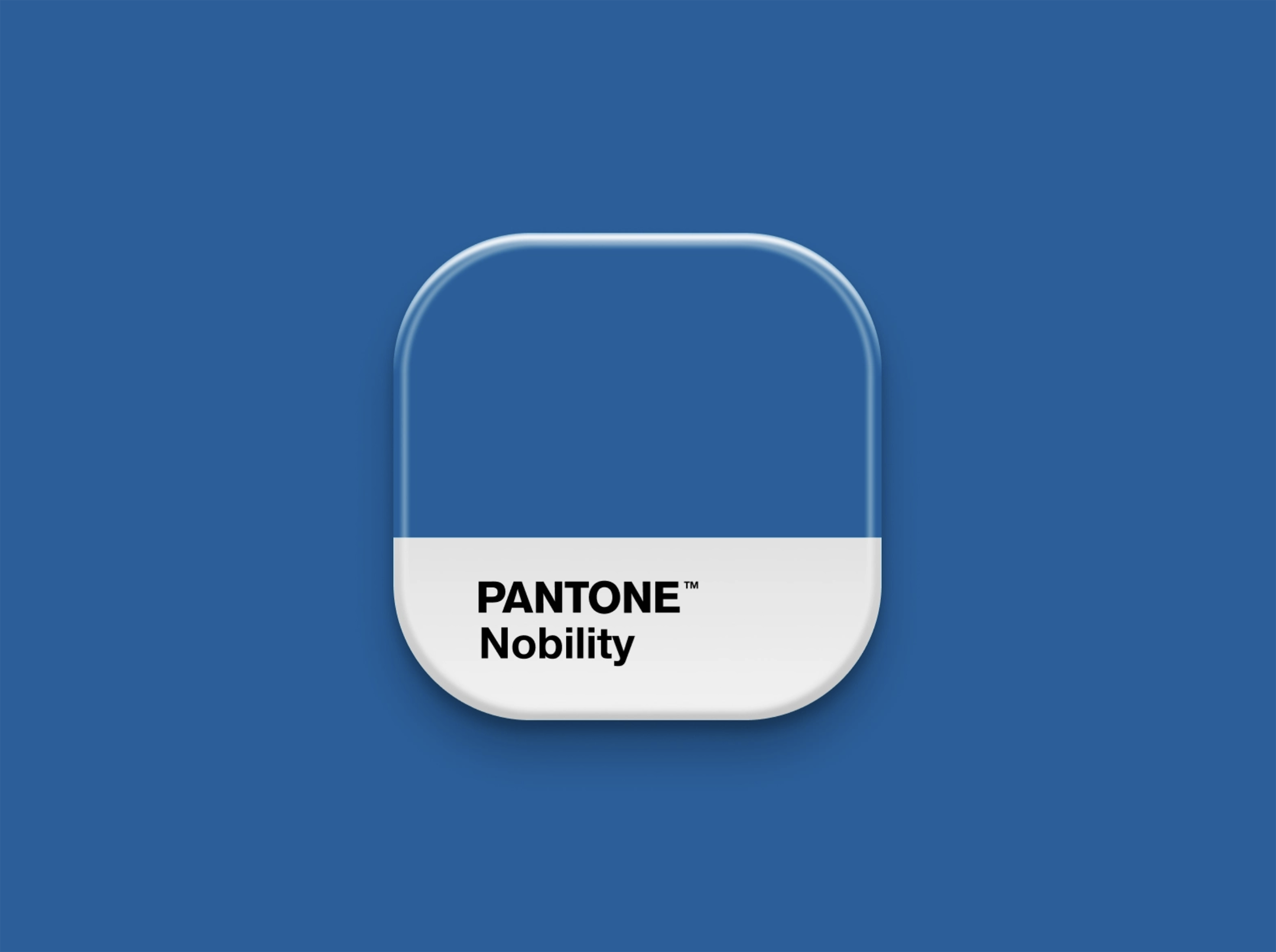
- Dark Blue -Professionalism, security, and formality
- Pink -Femininity, tenderness, sweet, cute, romance, sensitivity, youth, and innocence
- Brown -Aged, stability, support, warm, practical, dependable, and earthy
- White -Cleanliness, pure, health and simplicity
- Black -Sophisticated, professionalism, simplicity, luxurious, and modern

How to Pick your Brand Colours
When creating a brand colour, you should pick a base, accent and neutral:
- Base – A base colour should reflect your brands essence. It should not only reflect your brand’s most dominant personality trait but also appeal to your target audience.
- Accent- This will be the brands second most used colour. It must match a brand personality trait as well as compliment your base colour and appeal to your audience.
- Neutral- Your neutral colour will most likely be a background colour, and should be something that avoids added attention. Normally it would be a hue of grey or a beige, white or off-white. Black is also an option.
Your brand colours are on your website, logo, store design, advertisements, packaging and stationery and more importantly than ever in all your social media channels. They must ensure your brand colours reflect your brand personality and appeal to your target market.