
Have you ever picked up a brochure or pamphlet only to find that the font is too small, the colours are difficult to distinguish, and the overall layout is confusing? For individuals with visual impairments, cognitive disabilities, or physical limitations, accessing print materials can be a frustrating and sometimes impossible task.
That’s why designing for accessibility is crucial in creating print materials that everyone can use. In this article, we’ll explore tips and best practices for designing accessible print materials that cater to diverse user needs and help reach a wider audience.
Importance of designing accessible print materials
Designing accessible print materials is essential for ensuring that everyone can use and access the information presented. Accessibility in print design means creating materials with consideration for diverse user needs, including individuals with various disabilities such as visual impairments or cognitive disabilities.
By designing with accessibility in mind, you are not only making your content available to a wider audience but also demonstrating inclusivity and respect for diversity.
Creating accessible print materials benefits not only those with disabilities but also older adults who may have difficulty reading small fonts or low contrast text. Additionally, implementing accessible design principles can improve overall usability and readability of the material even for those without disabilities.
In today’s digital age where most information is readily available online, it’s important not to forget about those who still rely on printed materials. By prioritising accessibility in print design, we create an inclusive environment where everyone has equal access to vital information and resources.
Accessibility in the context of print design
Inclusive design is a key component of accessibility in print design because it aims to create products that can be used by everyone regardless of their abilities. This means designing materials that are easy to read, understand and navigate for all users.
The goal of accessible print material is to ensure that people with disabilities can access the same information as everyone else without facing any barriers. Print designers should aim to create clear and concise content using fonts, colours, spacing and organisation techniques that cater for different user needs.
Designers must consider factors such as font size, contrast levels between text and background colour, line-heights (space between lines), language complexity level among others when creating accessible print designs. These considerations ensure users can easily read through texts without straining their eyes or losing track of sentences.
The importance of inclusive design
Designing for accessibility is more than a moral obligation; it makes good business sense. By creating accessible print materials, you are opening up your brand and message to a wider audience. This includes people with disabilities, seniors, those who speak English as a second language and those with different learning styles.
When you design with inclusivity in mind, you make it easier for everyone to access your information. As a result, you can expect better engagement rates from all users. Accessibility creates user-friendly experiences that lead to increased customer satisfaction and loyalty.
Understanding diverse user needs and disabilities
Designing print materials that are accessible to everyone requires an understanding of diverse user needs and disabilities. Each person has unique abilities and limitations, which means there is no one-size-fits-all solution for accessibility.
Visual impairments can range from near-sightedness to total blindness. To accommodate visually impaired users, designers should consider using larger font sizes, high contrast colour schemes, and clear spacing between lines of text.
Cognitive disabilities can make it difficult for individuals to process complex information or follow multiple steps at once. Designers should aim for simple language, concise messaging, and visual aids such as icons or infographics.
Physical disabilities may limit a person’s ability to hold or manipulate printed materials. Designers can address this by creating lightweight materials with easy-to-grip edges or incorporating braille labels into the design.
Selecting legible fonts and font sizes
When designing print materials, it’s important to consider the diverse range of users who will interact with your content. One key aspect is selecting legible fonts and font sizes that cater to different needs.
For individuals with visual impairments or reading difficulties, larger fonts may be necessary for improved readability. However, it’s crucial not to go overboard – excessively large font sizes can make the text appear childish and patronising.
Choosing a clear and simple typeface is also essential for accessibility. Avoid decorative or elaborate fonts that can be difficult to read, especially when presented in small sizes.
Another consideration is contrast between the text and background. Black on white offers high contrast, but some individuals may find this too harsh on their eyes. Experimenting with other colour combinations could help accommodate these users while still maintaining legibility.
Contrast and colour considerations
When designing print materials that are accessible to everyone, it’s essential to consider contrast and colour. These elements play a crucial role in improving readability for individuals with visual impairments or other disabilities.
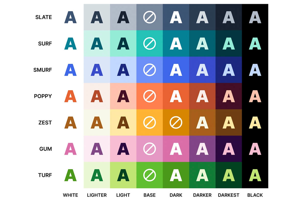
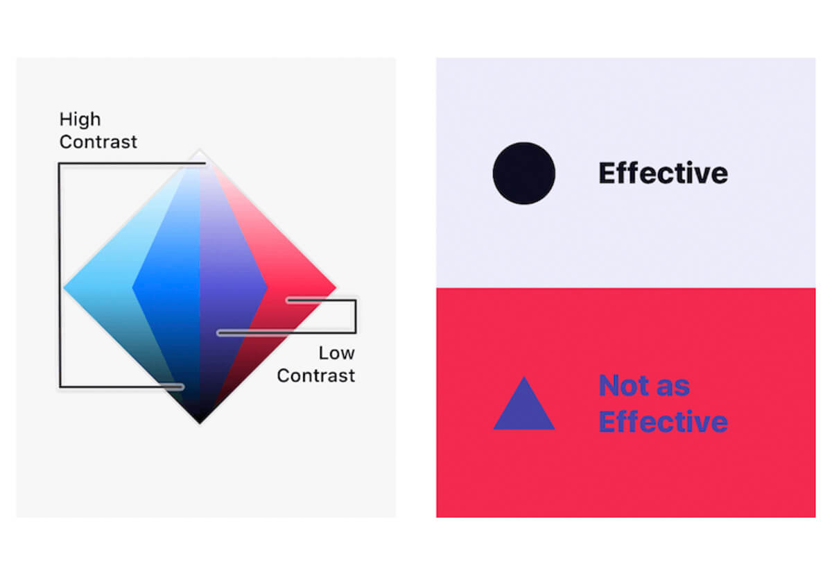
Choosing the right colour scheme is crucial to ensure that text stands out from the background. Avoid using similar shades as this could cause confusion among readers. Instead, opt for high contrasting colours like black on white or dark blue on light grey.
It’s also important to consider the use of colour when conveying information in your print materials. For example, avoid relying solely on colour-coding to convey instructions or messages as some readers may have difficulty distinguishing between different colours.
Proper spacing and line height for easy reading for diverse user needs
When designing print materials, it’s essential to consider the spacing and line height for easy readability. Proper spacing between lines helps prevent eye strain and allows readers with visual impairments to distinguish between different lines of text easily. The recommended line height is 1.5 times the font size or greater.
For individuals with dyslexia, proper spacing can make a significant difference in their reading experience. Increasing space between letters and words can improve word recognition and comprehension, making it easier for them to read.
Utilising clear and concise language
One of the key principles of accessible design is the use of clear and concise language. This means avoiding technical jargon, complex vocabulary, or lengthy sentences that may be difficult for some readers to understand.
When creating print materials, it’s important to consider the diverse needs of your audience. Some individuals may have cognitive disabilities that impact their ability to process information quickly or accurately. Others may have limited English proficiency, making it challenging to understand complex terminology.
To make your print materials more accessible, consider using simple language that is easy for everyone to understand. Break down complex concepts into smaller pieces and use concrete examples whenever possible.
Effective use of colour
Colours are a powerful tool in print design, but they can be tricky when it comes to accessibility. Effective use of colour is crucial for conveying information to diverse user needs. For individuals with visual impairments who cannot distinguish between different colours, it’s important to utilise other visual cues such as texture or pattern alongside colour.
To ensure the readability of text, designers should avoid using low-contrast colour combinations that make text difficult to read. Instead, opt for high contrast pairings such as black on white or white on black. This will help individuals with low vision or dyslexia easily distinguish and comprehend the content.
Designers should also consider incorporating secondary design elements such as textures and patterns that complement their primary colour scheme. These additional elements provide an extra layer of information for those who may not perceive all colours equally.
Creating meaningful visual hierarchy and organisation
When it comes to designing print materials that are accessible, creating meaningful visual hierarchy and organisation is crucial. This means arranging content in a clear and logical order so that users can easily navigate through the material.
One way to achieve this is by using headings and subheadings. These help break up the text into smaller, more manageable sections and provide an overview of what’s included on each page or section.
It’s also important to use consistent formatting throughout the document. This includes font size, style, spacing, and alignment. By maintaining consistency, users can quickly identify different types of content such as headings or bullet points.
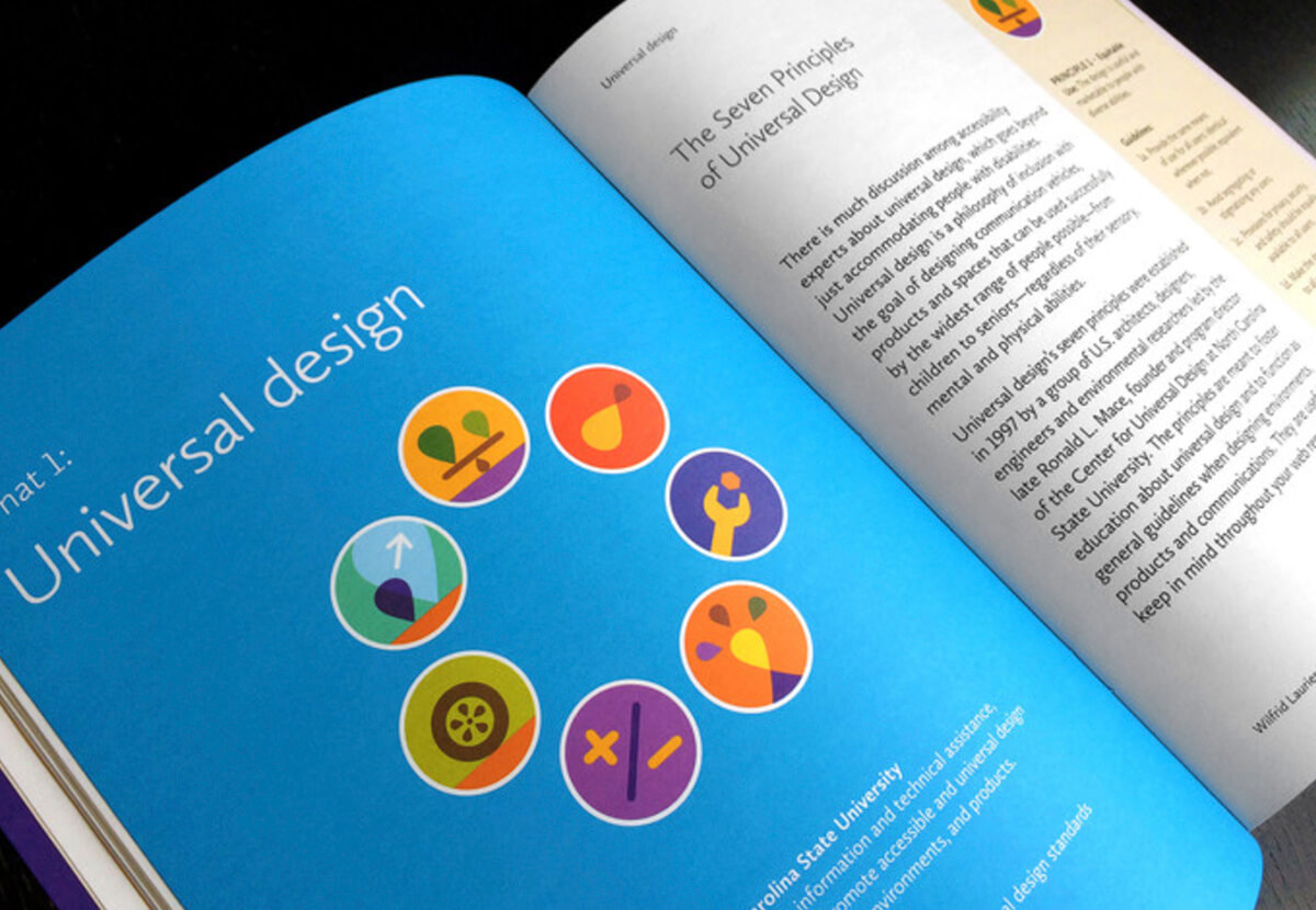
Using appropriate icons and symbols
When designing print materials for accessibility, it’s important to keep in mind that icons and symbols play a crucial role in conveying information. These visual elements can be used to help users quickly identify the purpose of certain content or actions.
However, it’s important to consider the diverse needs of your audience when selecting icons and symbols. For example, using only colour as an indication may not be effective for individuals with colour blindness. Instead, consider incorporating shapes or patterns along with colours.
Icons should also be clear and easily recognisable. Avoid using complex or abstract illustrations that could potentially confuse users with cognitive disabilities.
Also consider the placement of icons within the design layout. Icons should always be placed near relevant text or content so that their meaning is clear and contextualised.
Consistent and intuitive navigation
When designing print materials for accessibility, it’s important to consider the navigation structure of your document. This means ensuring that users can easily find and access the information they need without getting lost or confused.
Consistency is key when it comes to navigation structures. This means using similar formatting and design elements throughout the document, such as consistent font styles and sizes, placement of headings and subheadings, and use of bullet points or numbered lists.
Intuitive navigation also plays a big role in making print materials accessible. This involves organizing content in a logical way that makes sense to users with diverse needs. For example, using descriptive headings that accurately reflect the content beneath them can help users quickly locate relevant information.
Clear headings and subheadings
Clear headings and subheadings are essential for organising content in print materials. They make it easy for diverse users to navigate the information presented, especially those with cognitive or visual impairments who may have difficulty processing large blocks of text.
When creating headings and subheadings, it’s important to use clear and concise language that accurately reflects the content beneath them. Avoid using overly complex or technical terms that could confuse readers.
To enhance readability, consider using larger font sizes for main headings and bolding or underlining them to make them stand out on the page. Subheadings should also be clearly differentiated from main headings through font size or formatting such as italics.
A consistent hierarchy of headings can also aid in navigation throughout a document. For example, if there are multiple levels of subheadings within a section, ensure they are consistently formatted so users can easily distinguish between them.
Utilising bullet points and numbered lists
Bullet points and numbered lists are effective tools for improving the readability of print materials. These formatting techniques help break down information into bite-sized chunks, making it easier to digest for users with diverse needs.
When creating bullet points or numbered lists, it is important to keep them concise and clear. Each point should be a single idea or concept that is easy to understand. Avoid using too many sub-points as this can become overwhelming for some individuals.
Using bullet points and numbered lists also helps organise content in a logical manner. It allows readers to quickly scan through the material and locate relevant information without having to read every word on the page.
Avoiding complex or cluttered layouts
When designing print materials for accessibility, it’s crucial to consider the layout of the content. Complex and cluttered layouts can be overwhelming and confusing for diverse user needs, making it difficult for them to comprehend information.
To avoid complex or cluttered layouts, start by simplifying your design. Stick to a clean and minimalist approach that is easy on the eyes. Avoid using too many elements such as images, graphics, colours, fonts or decorative borders that may distract from the main message.
It’s also important to ensure proper spacing between elements in your design. White space can help break up dense blocks of text and make it easier for readers to navigate through content. Adequate margins around each element will enhance readability while giving users enough room for their fingers when holding printed materials.
Accessible Print Materials for Different Disabilities
When it comes to designing accessible print materials, it is important to consider the diverse needs of individuals with different disabilities. Designing for accessibility is about creating print materials that can be used by everyone, regardless of their abilities or disabilities. By implementing accessible design principles in your print materials, you are not only making them more user-friendly but also reaching a wider audience. It’s essential to understand diverse user needs and incorporate features that enable all users to access and understand the information presented.