Print Trends for 2027: What Is Worth Bringing Into Your Next Design?
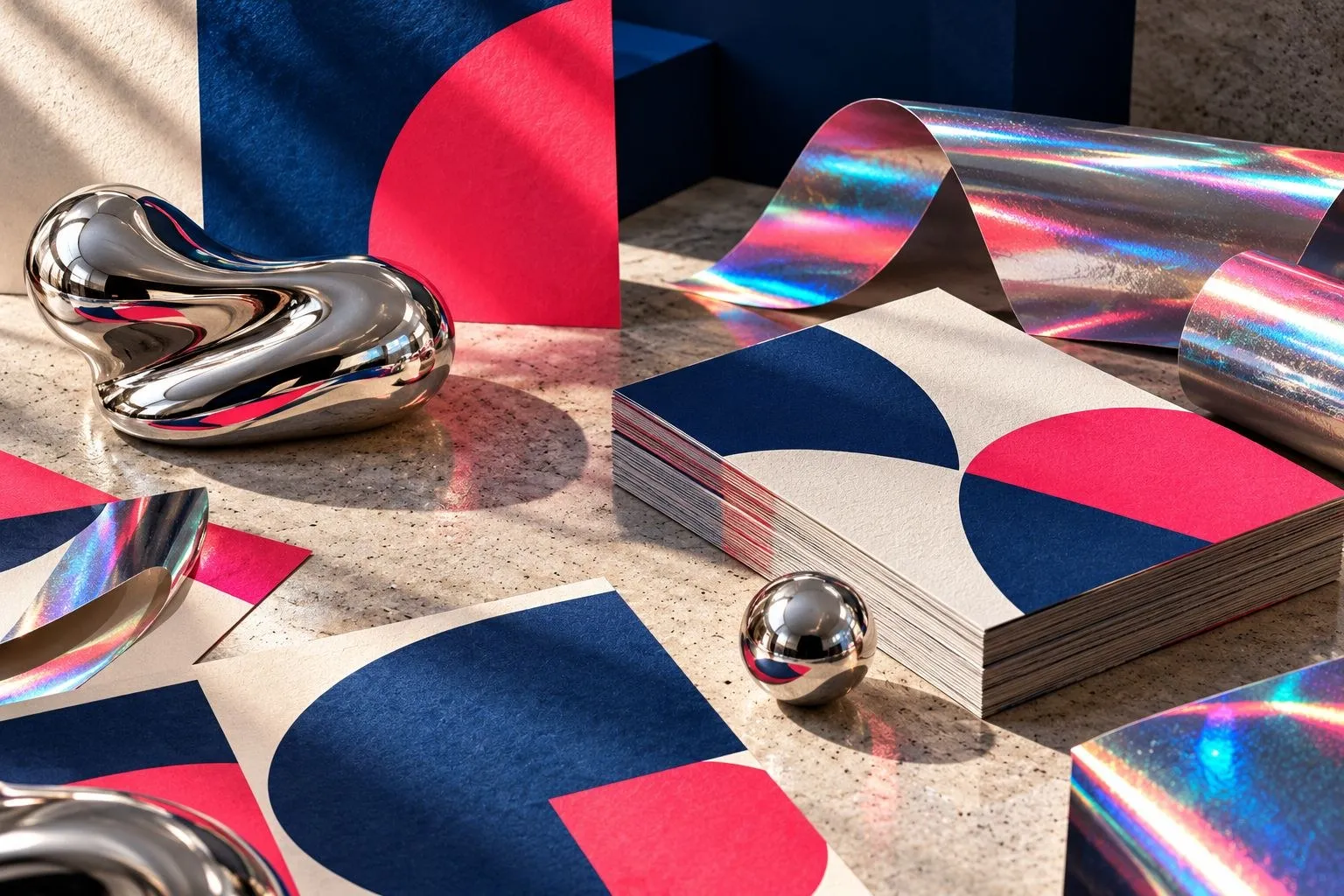
A trend can give a design fresh energy. It can also make a business look as though it borrowed someone else's clothes.
As we look towards 2027, the most useful ideas are already visible in current print design: clearer typography, tactile materials, confident colour, smaller editions and a reaction against images that feel too perfect to be real.
These are directions to explore, not a prediction that every brand will look the same next year. Choose what helps your message. Leave the rest alone.
Big type, less competing noise
Strong typography can do the work of a busy collection of graphics. A confident heading, a clear supporting line and enough space can make a poster or cover feel current without adding much decoration.
The important part is the hierarchy, not simply making everything large. Someone still needs to understand what the piece is for.
Try removing one competing element before adding another. Then print the layout at its actual size. Does the main message lead? Is the practical information readable? Does the design work when you are not zoomed in on a screen?
An expressive heading is useful only if it leaves the rest of the piece easy to use.
Colour with a point of view
Bright colour is part of current design discussion, but "bright" is not a complete brief. One confident accent can be more effective than a whole sheet of competing colours.
Try a warm neutral background with a sharp red, cobalt or green detail. Or build the design around a bold colour field and a disciplined layout. These are design suggestions, not an official colour forecast.
Check contrast and print behaviour before committing. A luminous screen colour may not reproduce as you expect on paper. The stock, print process and colour settings all affect the result.
Ask about a proof when colour is important. Do not choose a palette from a glowing laptop alone.
Paper that is allowed to feel like paper
Visible texture, uncoated surfaces and restrained finishes can give print a physical character that an image on a screen cannot reproduce.
That does not make uncoated stock the right choice for every job. A photographic brochure, a wipeable menu and a written invitation have different requirements.
Choose the material before the layout is final. Look at how detail, contrast and ink coverage behave on the proposed sheet. Keep the design honest about the material rather than trying to make every paper imitate the same glossy surface.
One tactile detail, not every finish
A carefully chosen embossed area, a contrast between matt and gloss, or a strong fold can give a piece a memorable moment.
The key is restraint. If every surface demands attention, the finish becomes the message.
Before requesting an effect, ask what it contributes and what it changes: cost, production, durability and recycling suitability. Some treatments complicate the finished item's end of life. A fashionable finish is not a reason to skip that conversation.
For many jobs, good stock and a confident composition will do more than an added effect.
Human marks and believable imagery
Current design commentary includes a response to generic AI polish: collage, grain, hand-drawn details and controlled imperfection.
Use that idea with care. A rough edge can give a design character. A blurry product photograph can simply make the product hard to see.
Prefer real work photographs when they communicate the subject. If you use generated imagery, treat it as illustration rather than evidence of a job, a place or a customer. Keep essential wording separate from the image so it can be checked and edited properly.
A believable image needs coherent light, sensible materials and a clear subject. "Photorealistic" in a prompt is only a starting point.
Smaller editions, stronger relevance
Short runs and versioned designs are another useful direction. A seasonal cover, local event version or limited release can make a familiar piece more relevant without replacing the whole visual identity.
Design a system that allows those variations. Keep the permanent elements consistent and define what changes. Check every version, including the long names and awkward dates.
Before trying a trend, ask three things: does it fit our audience, does it make the message clearer, and will we still like it when the immediate fashion passes?
If the answer is no, skip it. Contemporary print is not a collection of fashionable effects. It is a good idea, designed for the people who will actually see and use it.
Get in touch
If you have a question about your next job, visit our shop on Glasnevin Avenue, Glasnevin, email hello@printready.ie, or call (01) 858 1000.