How Colour in Advertising Influences Your Target Audience And Brand
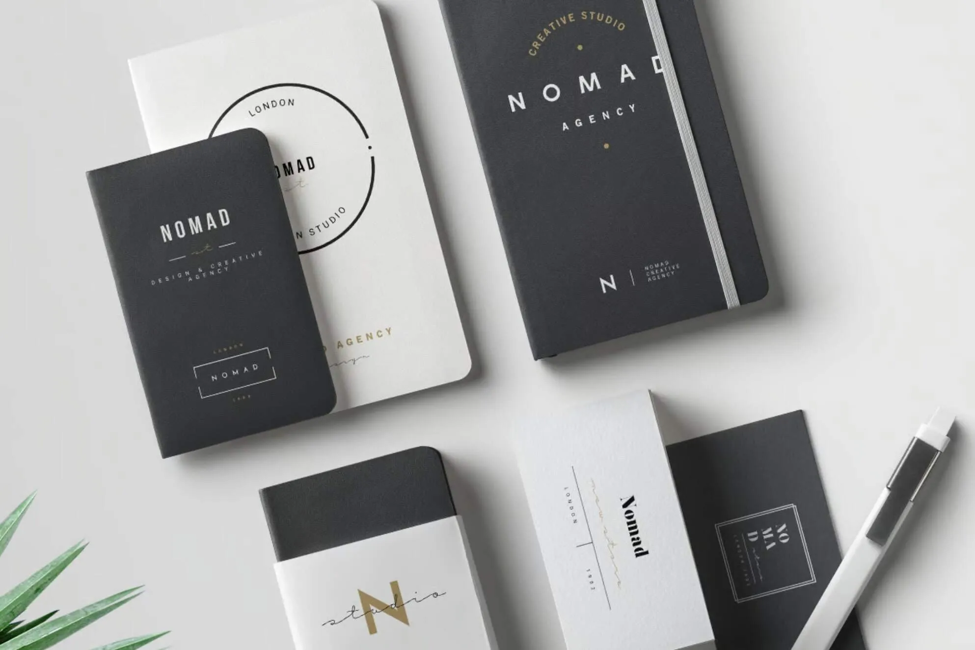
Choosing the right colour palette is not just about design — it’s about communication.
Colour: The Silent Salesperson
People make decisions quickly, and colour plays a major part in that process. From bold sale signs to calming corporate branding, colour works instantly to attract attention and guide perception.
 |  |  |
In busy environments, such as high streets and retail spaces, colour often does the work before a single word is read.
The Psychology Behind Colour
Different colours trigger different emotional responses. Understanding this helps you communicate more effectively with your audience.
- Red: Energy, urgency, attention
- Blue: Trust, calm, professionalism
- Green: Nature, health, balance
- Yellow: Optimism, warmth, youth
- Purple: Luxury, creativity
Using the right colours ensures your brand message is felt as well as seen.
Consistency Builds Recognition
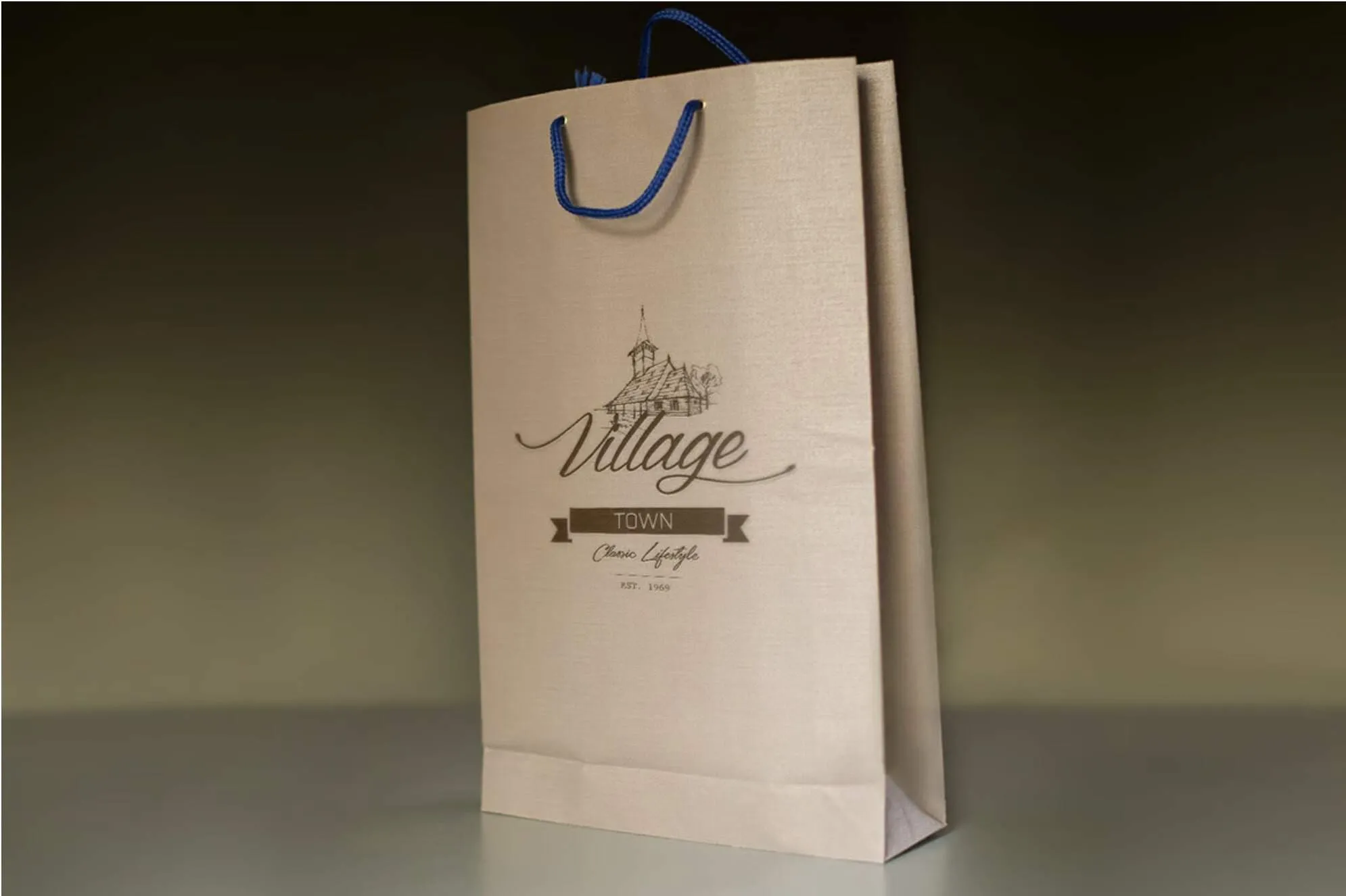
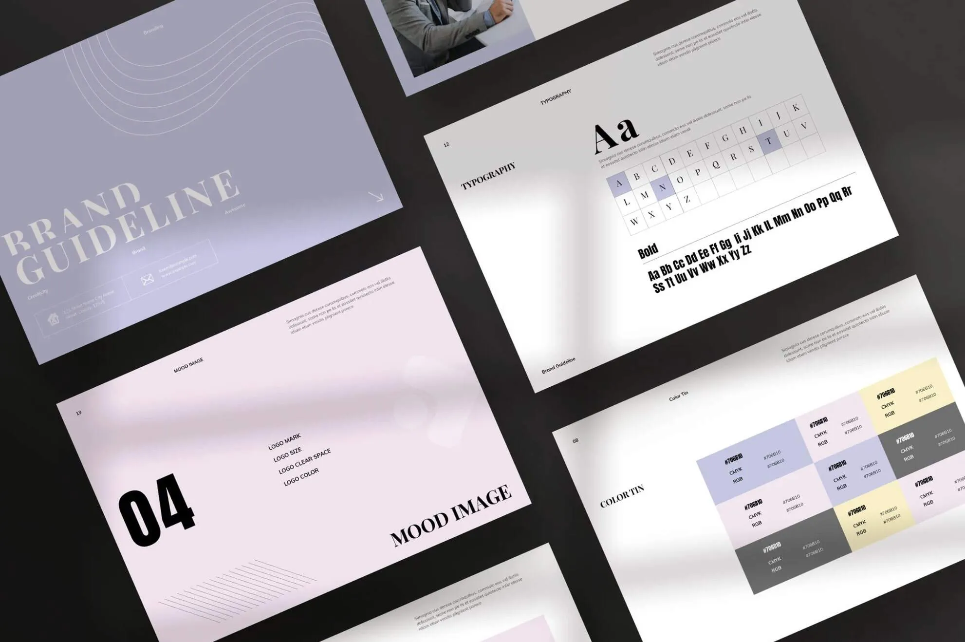
Consistent use of colour across all marketing materials strengthens brand identity. Whether it’s business cards, brochures, signage, or packaging, your colours should remain the same across every touchpoint.
This consistency helps customers recognise your brand instantly and builds trust over time.
Print vs Digital: Why Colour Matters More in Print
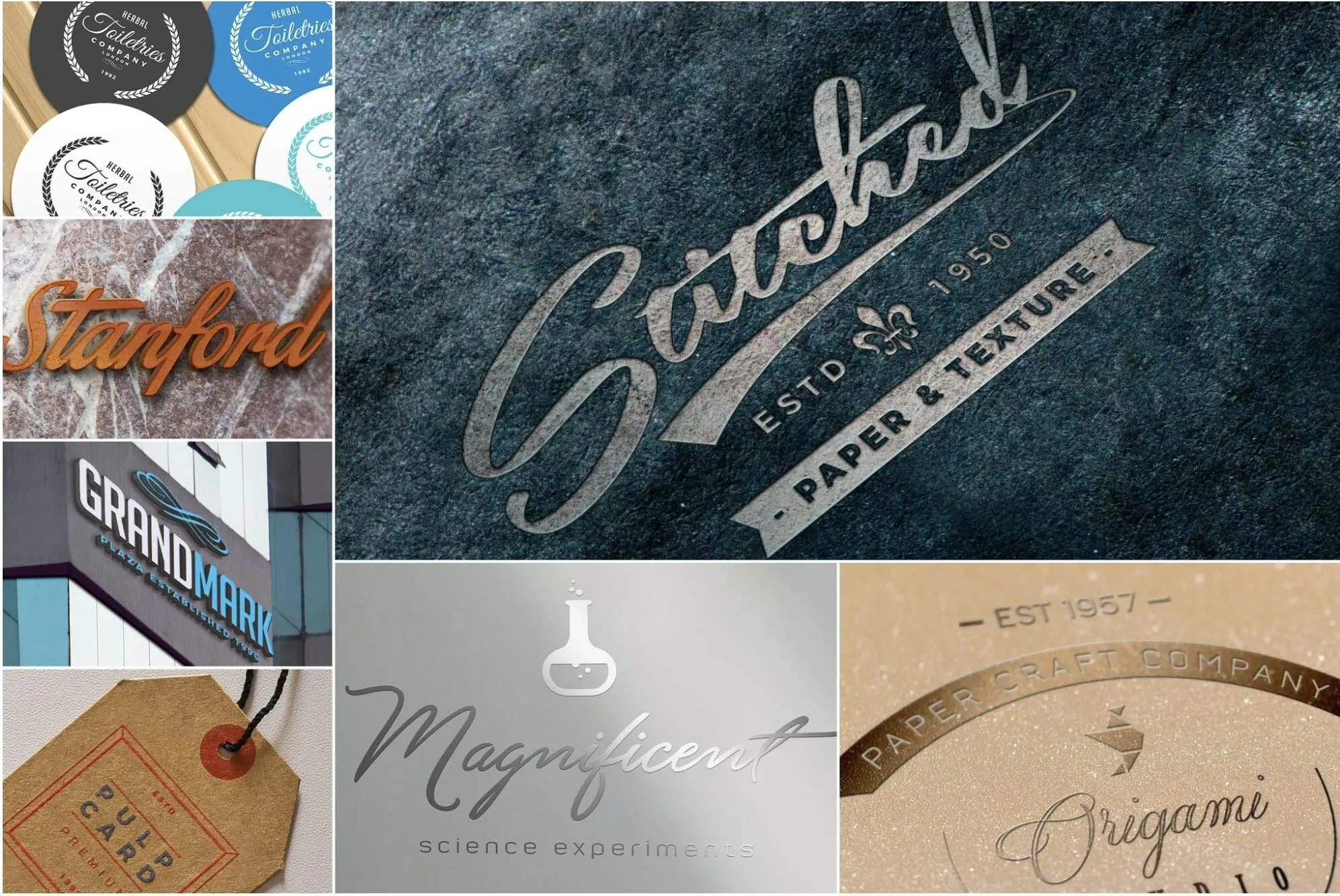
Printed materials offer a more immersive experience than digital screens. The texture of paper and the depth of printed colour create a stronger connection, helping your message stand out and be remembered.
Print allows colours to feel richer and more impactful, especially when combined with the right paper stock and finish.
Know Your Audience
Colour preferences can vary depending on your audience. Age, industry, and expectations all play a role in how colours are received.
A vibrant, bold palette may suit a modern retail brand, while a more subtle and refined scheme may be better for professional services.
Choosing the Right Finish
The finish you choose can influence how colours appear:
- Gloss: Enhances vibrancy and contrast
- Matte: Creates a softer, more refined look
Even small design decisions can have a big impact on how your brand is perceived.
Sustainable Colour Printing
Modern printing allows businesses to achieve strong, vibrant colours while still making environmentally responsible choices. Recycled papers and eco-friendly inks help reduce environmental impact without compromising quality.
Make Colour Work for Your Brand
Colour is more than decoration — it’s a strategic tool. When used correctly, it can strengthen your brand, attract attention, and influence customer decisions.
If you need advice on print and design, contact hello@printready.ie or call (01) 858 1000 – we will be delighted to help.