Why Colour Scheme Is So Important When Branding Your Business

Creating a brand is all about colour. A strong brand identity is built on understanding the importance and impact of colour, especially when developing your own brand.
While colour on its own has no fixed meaning, it conveys emotions and feelings that vary depending on culture, experience, and context. Understanding colour perception is essential when creating a palette that connects with your audience.
Understanding colour perception
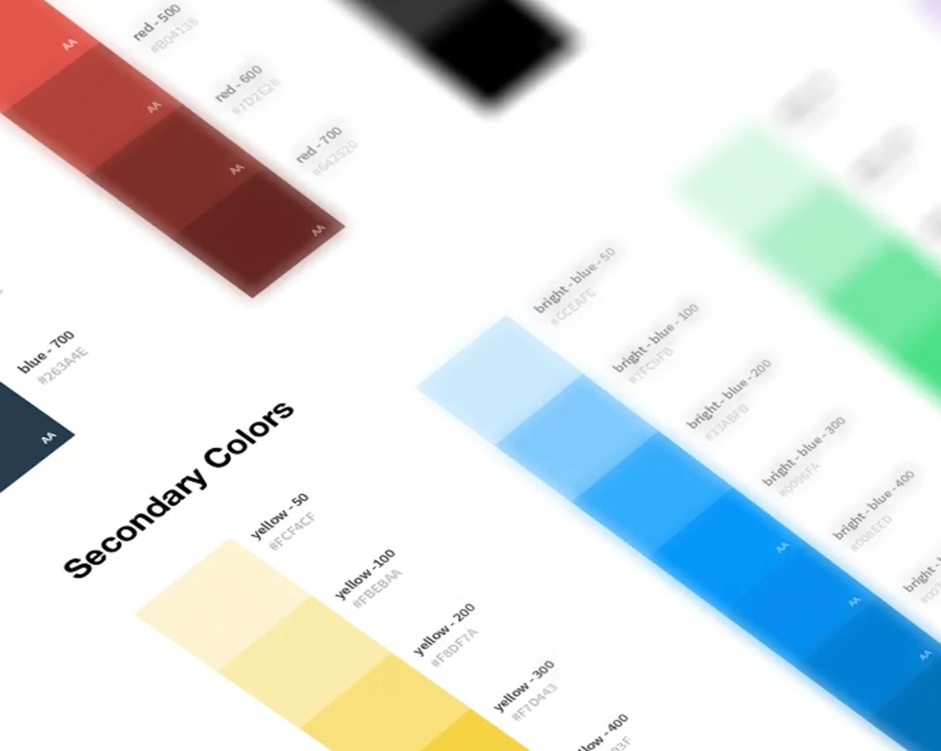
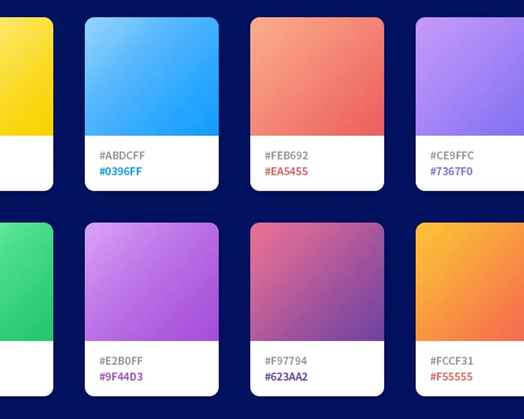
Colours on the warm end of the spectrum, such as red, yellow, and orange, are often seen as energetic, bold, and forward-looking. Cooler tones like blues and greens tend to feel calm, stable, and subtle.
 |  |  |
Choosing the right balance between these tones can shape how your brand is perceived.
The right approach to colour
Selecting a colour palette that aligns with your brand’s positioning is essential. Colour plays a key role in how customers identify and remember your business.
Whether it’s a green café logo or a bold, recognisable brand colour, consistency and clarity are what make brands memorable.
Know your target audience
Understanding your audience is critical when choosing your colour scheme. What do they value? What appeals to them?
Your colours should reflect your brand’s core values while building trust and familiarity. Inconsistent use of colour can weaken your brand perception and reduce credibility.
Why consistency matters
A consistent colour scheme helps build recognition and strengthens your relationship with customers. Over time, your colours become associated with your brand’s identity and personality.
Used correctly, colour can increase awareness and help your business stand out in a competitive market.
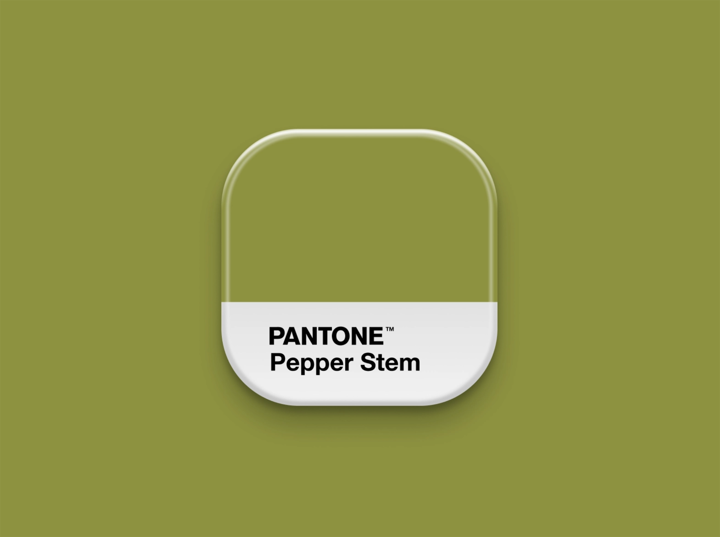
Colour meanings in branding
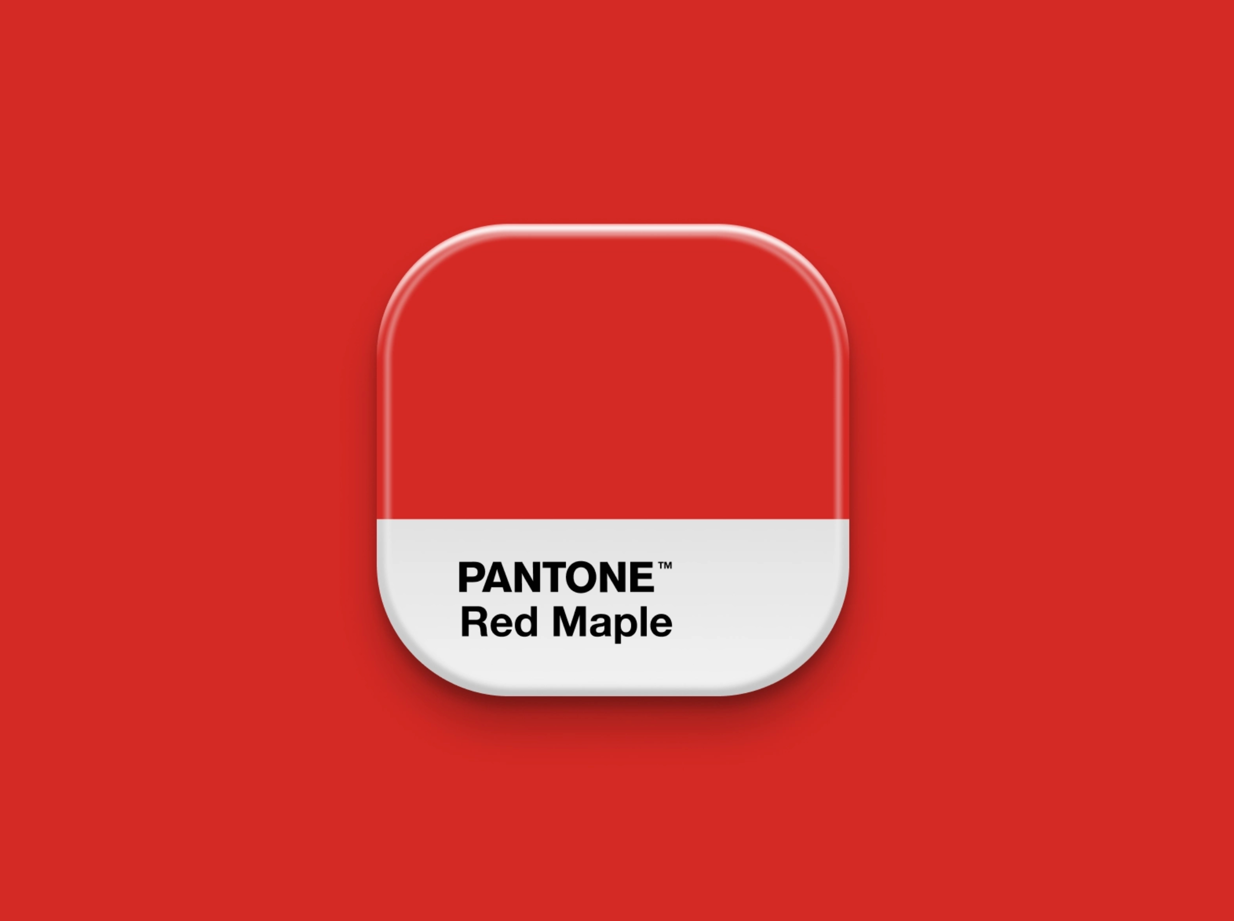
- Red: Excitement, danger, energy
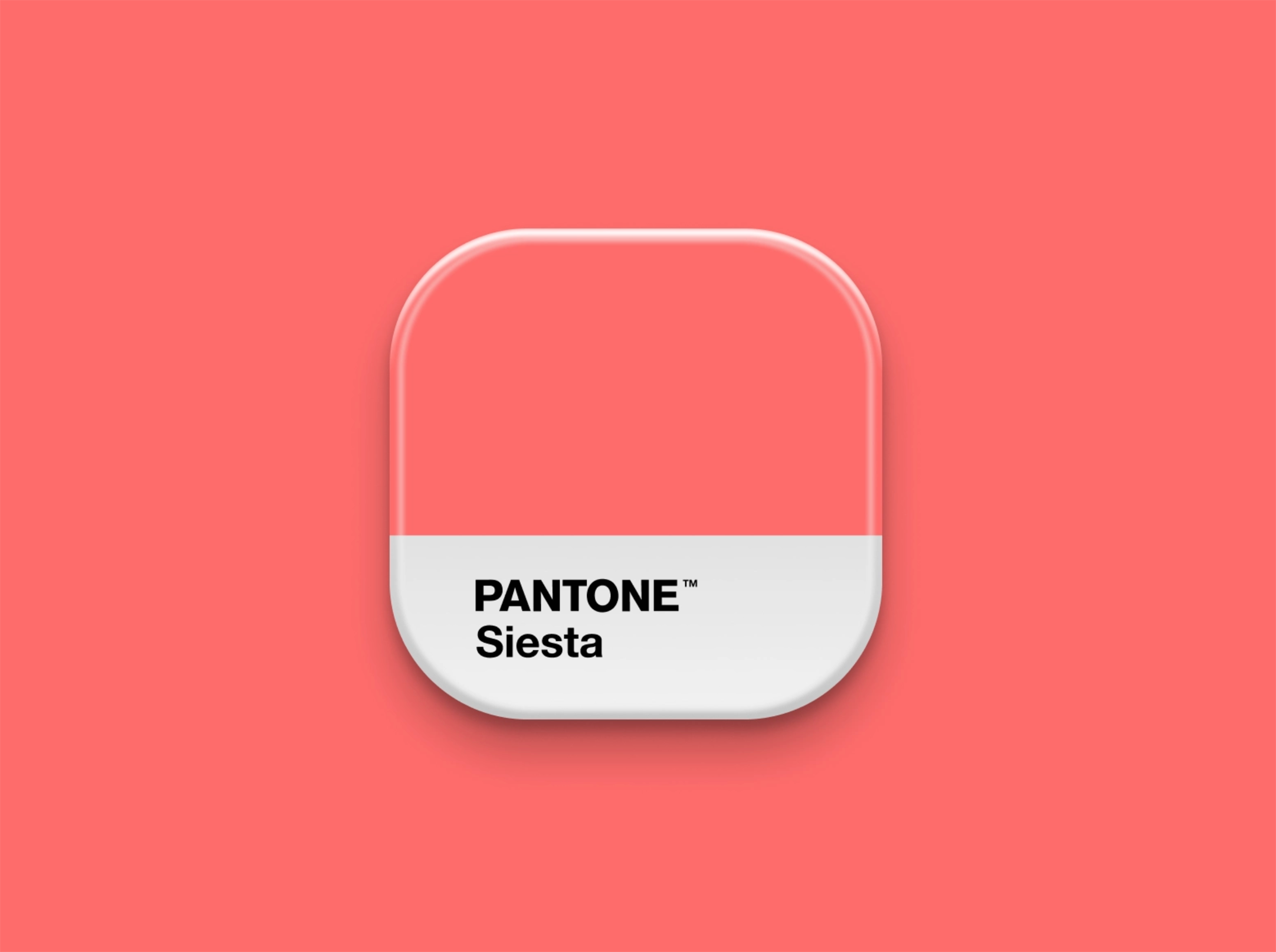
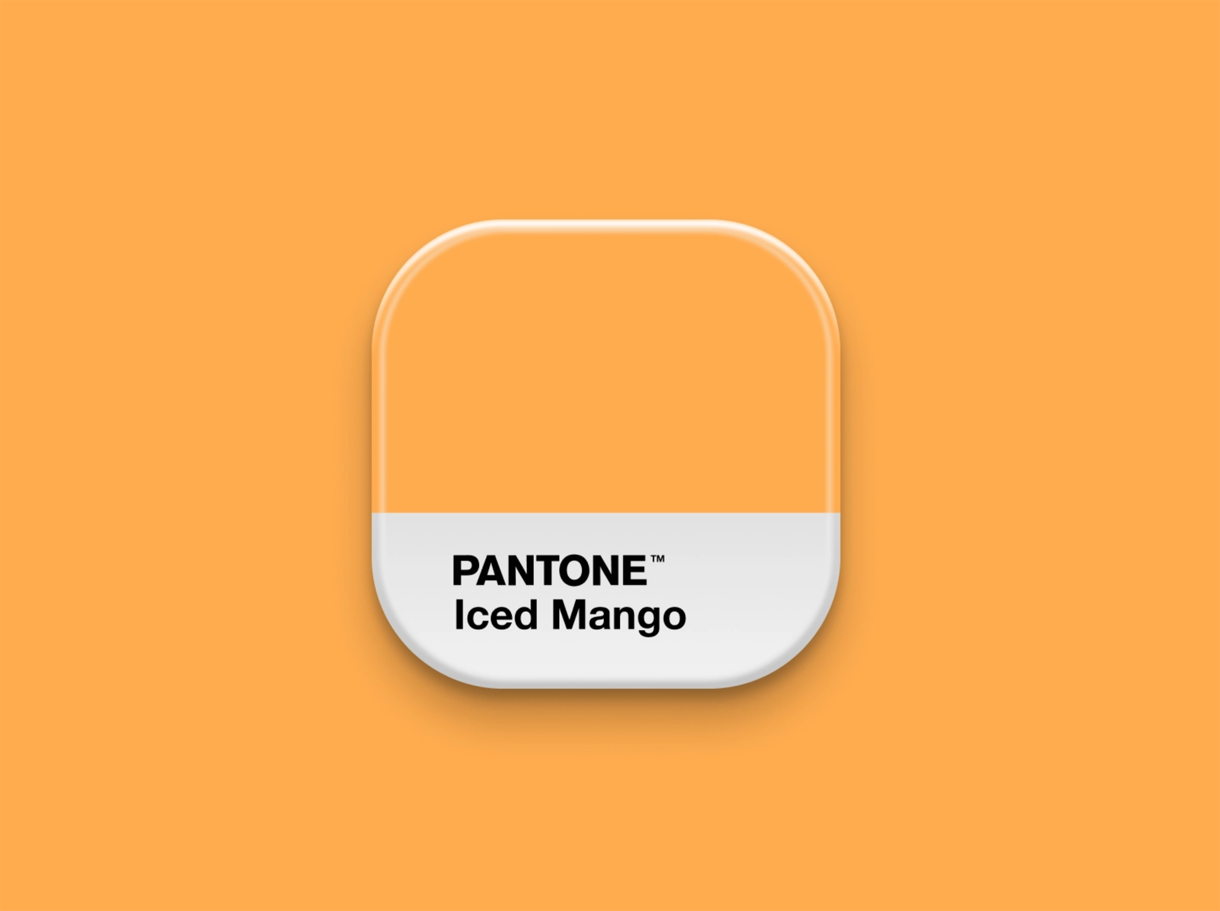
- Orange: Happiness, playfulness, friendliness
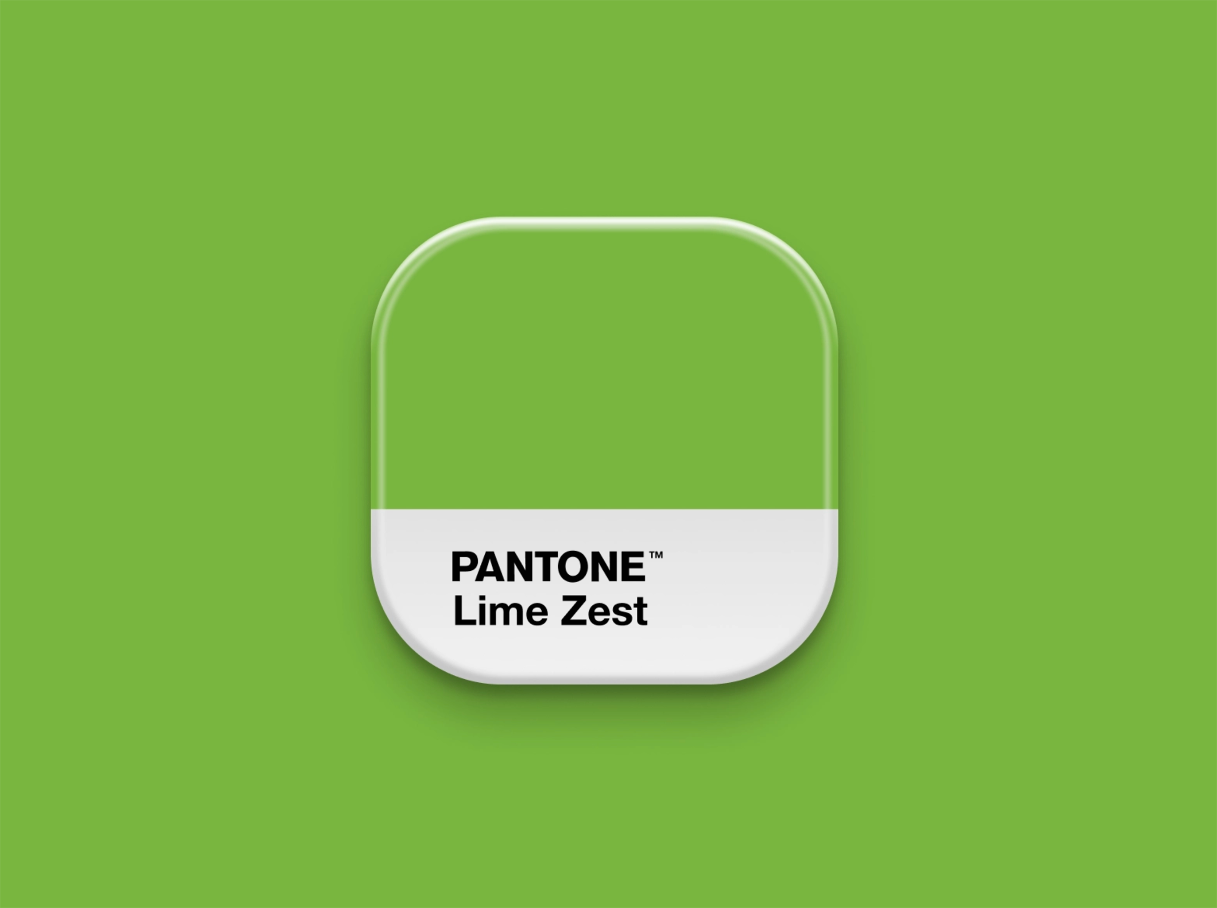
- Green: Growth, health, stability, prosperity
- Light Blue: Trust, calmness, openness
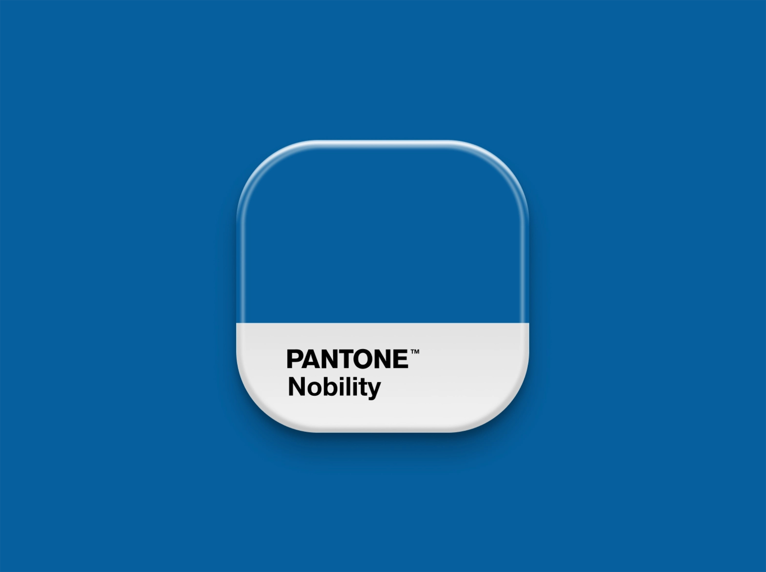
- Dark Blue: Professionalism, security
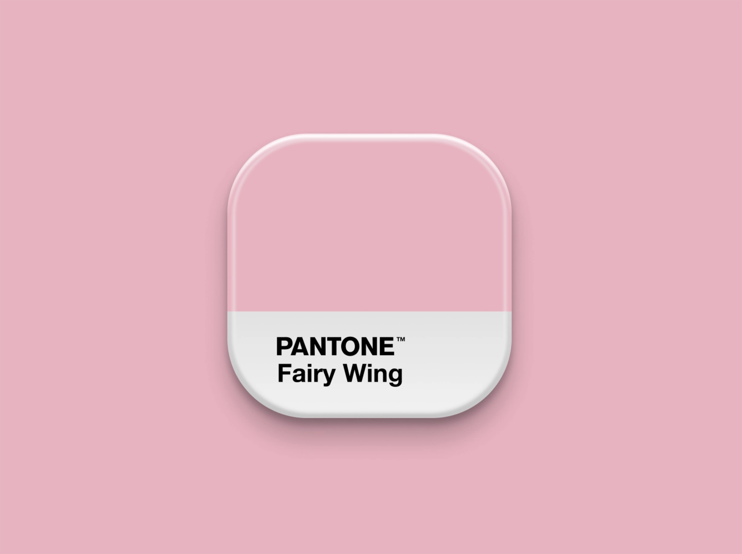
- Pink: Femininity, softness, romance
- Brown: Stability, warmth, reliability
- White: Cleanliness, simplicity
- Black: Sophistication, luxury, modernity
 |  |  |
 |  |  |
How to choose your brand colours
 |  |
Base colour
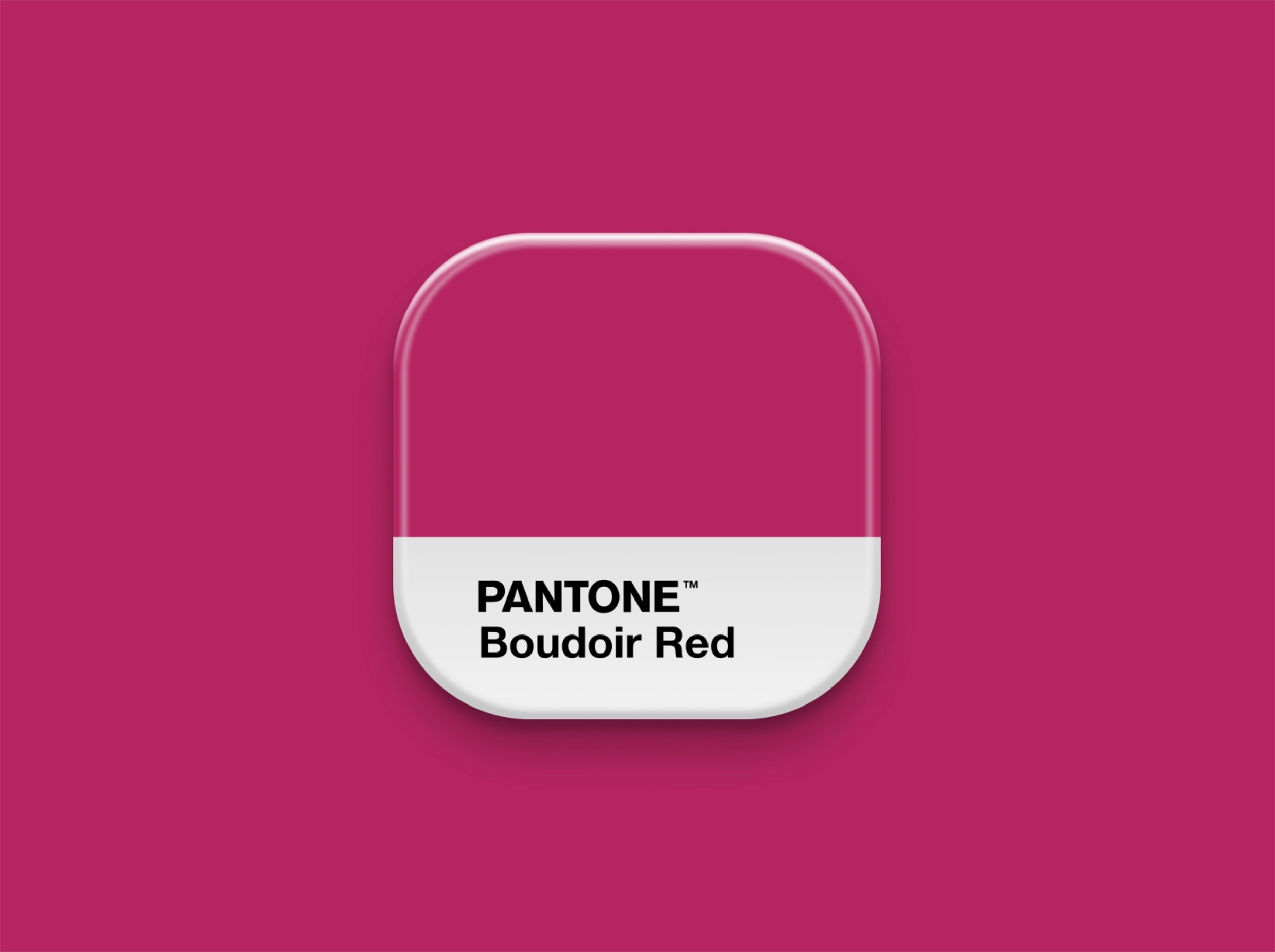
Your base colour should represent your brand’s core identity and main personality trait while appealing to your target audience.
Accent colour
This is your secondary colour. It should complement your base colour and support your brand personality.
Neutral colour
Neutral colours are typically used as backgrounds. These are often shades of white, grey, beige, or black, helping your main colours stand out without distraction.
Your brand colours should be used consistently across your website, logo, signage, packaging, and social media to reinforce your identity.
Get in Touch
Do you have a question about logo design and branding or need advice on the best approach for your business? Contact us at hello@printready.ie or call (01) 858 1000 – we will be delighted to help!