Make a Great First Impression: Letterheads and Envelopes That Mean Business
Email is quick, but a letter on good paper still means something. Invoices, quotes, contracts, offers and thank-you notes all land differently when they arrive on a proper letterhead in a matching envelope.
Why letterheads still earn their keep
- They look credible. A printed header says a real business sent this.
- They are remembered. A letter on good paper is kept more often than an email.
- They make small businesses look established.
- They work with your other print: cards, compliment slips and envelopes.
What goes on a letterhead
- Logo, top left or centred
- Business name, address and contact details, kept short
- Company number or VAT number if you need it, in small type at the foot
- Plenty of clear space for the letter itself
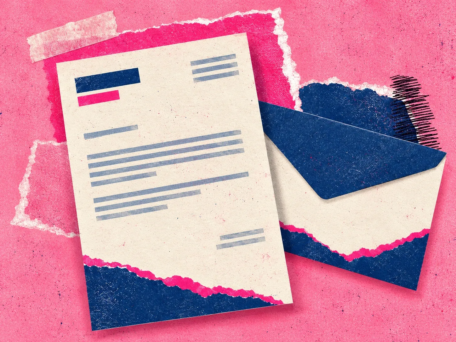
- A subtle brand element at the foot (the navy torn edge in the image above)
Envelopes matter too
The envelope is seen first. A return address on the back flap, a coloured inside, or a strip of brand colour makes it feel considered. Match the size to the paper: A4 letters folded in three go in a DL envelope, and a C4 takes it flat.
Design trends
- Torn paper, risograph and grainy textures that give a handmade look
- Two-colour designs. Navy and one bright is easy to print and easy to recognise.
- Minimal layouts that put the letter first
- Matching sets: letterhead, envelope, compliment slip and business card in the same palette
Practical tips
- Leave a margin where your printer or pen needs it.
- Choose paper that works in an office printer if people will print on it.
- Make sure text is dark enough to read when copied or scanned.
- Order sets together so colours match.
Order letterheads and envelopes from Print Ready.
View current products and options
Envelopes: https://www.printready.ie/business-stationery/envelopes/